Access is personal. So is the map.
Access Atlas is built on a simple distinction: accessibility describes a building, access describes whether a person can actually get what they need. One is a checklist. The other is personal.
The project
The concept behind Access Atlas has been in development for more than twenty years, long before comparable platforms appeared. It is now moving forward with a patent pending on the legal concept of obtaining access to personal needs, rather than standard accessibility compliance.
The first profiles prioritize high-need medical conditions and severe food allergies: people living with ulcerative colitis and Crohn's disease who travel long distances to specialty clinics, families managing egg-protein allergies that require specific kitchen practices, and travelers who need cabin dimensions and spatial detail before they board.
Access Atlas does not try to replace municipal systems like a county 2-1-1 database. Regional programs — county human services apps, medical transportation, health systems and disability organizations — become spokes connected to the Atlas hub, so people are referred to the right local option instead of a duplicate directory.
Hub and spoke
Regional partners plug into one national map.
Provenance first
Every access detail keeps its source and date.
Public accountability
Reviews are never anonymous.
Project walkthrough
Recorded material from the project team on the vision, branding direction and app functions.
Golden Ratio identity
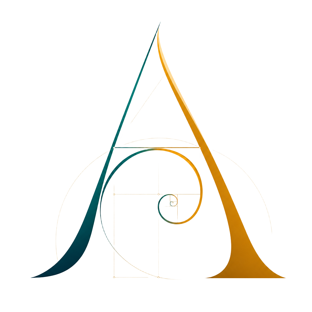
The brand is drawn from natural spiral geometry — the nautilus shell, the fern fiddlehead, the queen bee swirl, sand waves forming a letter A on the Lake Huron shoreline. The mark resolves a golden spiral into an A, and is intended to become an access-friendly stamp local businesses can display.
The Access Atlas stamp
Awarded from structured, verified access information — not self-declared compliance.